The Grid System
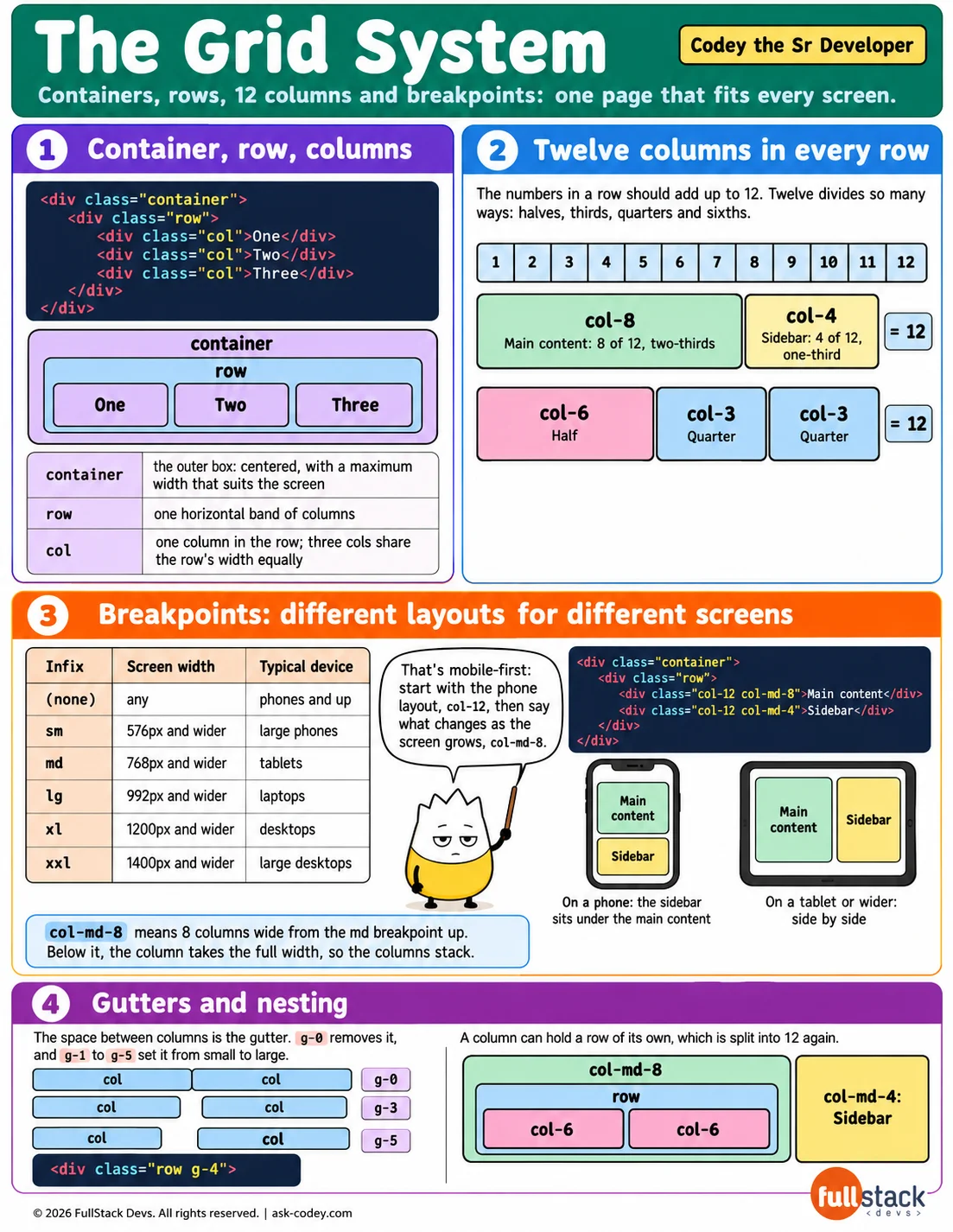
Lay out a page in Bootstrap's 12-column grid of containers, rows and columns, and make the layout change at each screen size with breakpoints.
Updated
- Category
- CSS
- Level
- Apprentice
- Tags
- Bootstrap Grid, Breakpoint (c-sharp), CSS, html, Mobile-first design, web-development