Fluid Type and Spacing with clamp()
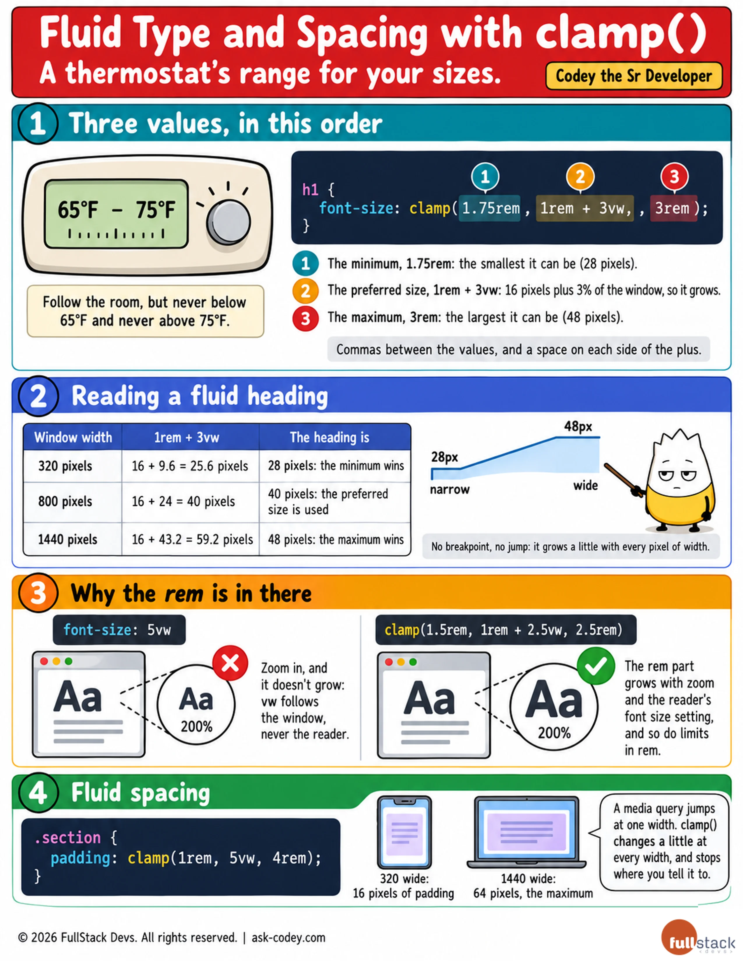
clamp() keeps a size between a minimum and a maximum and lets it grow smoothly in between, so headings and spacing fit a phone and a wide screen without a single breakpoint, while still following the reader's zoom.
Updated
- Category
- CSS
- Level
- Journeyman
- Tags
- clamp(), CSS, Fluid typography