Color That Works: Palettes and Contrast
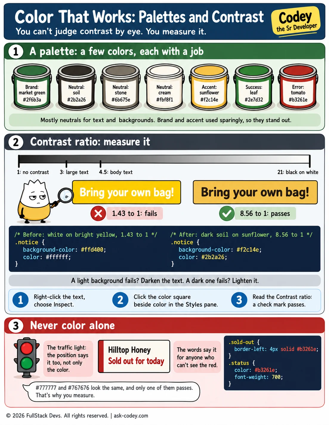
A small palette (a brand color, neutrals, an accent, and success and error colors) makes a site look like one brand, and text that meets a contrast ratio of 4.5 to 1, with meaning never shown by color alone, makes it readable for everyone.
Updated
- Category
- CSS
- Level
- Journeyman
- Tags
- Accessibility, Color, Color palette, Contrast ratio, CSS, WCAG, web-development