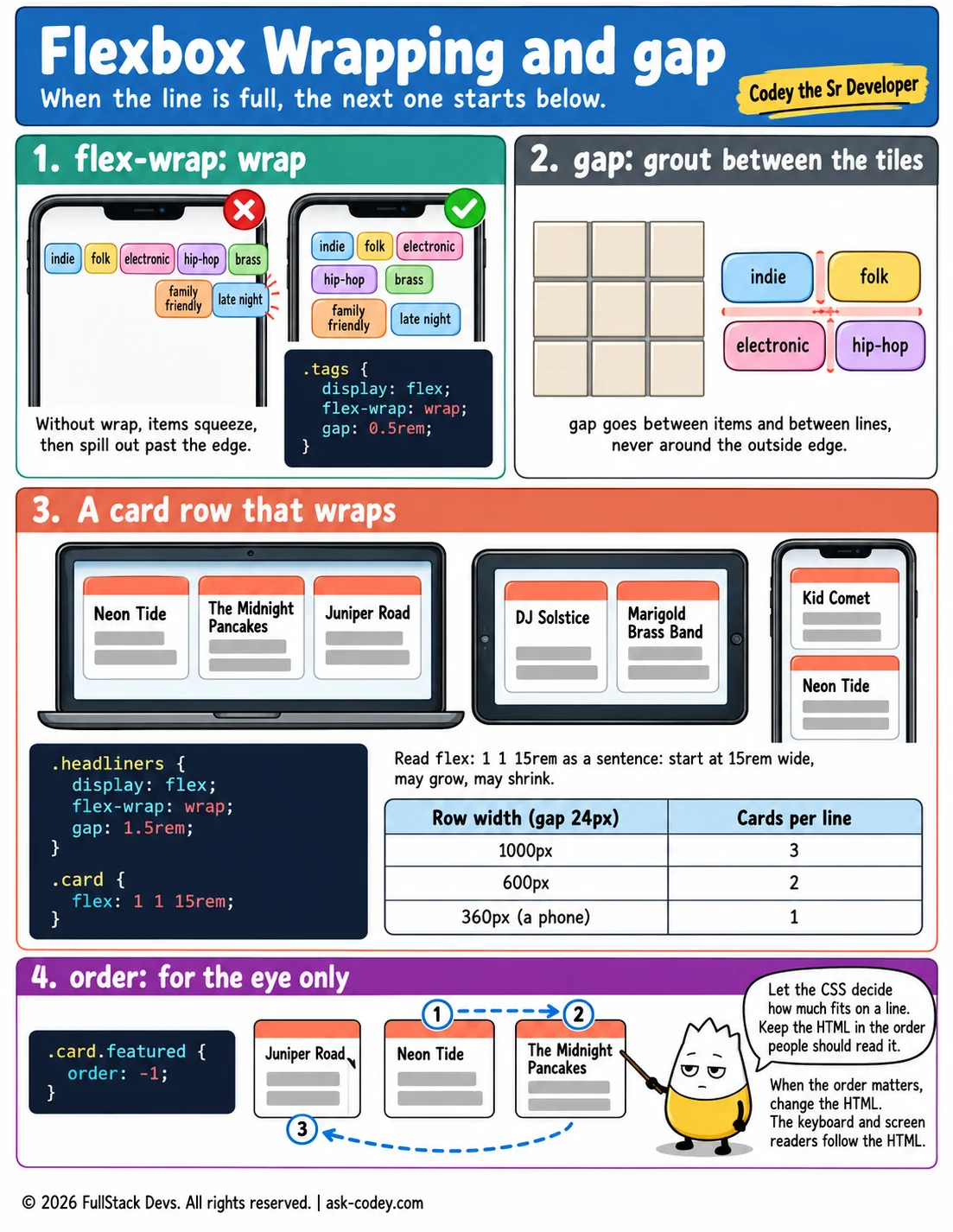
Flexbox Wrapping and gap
flex-wrap lets flex items move onto a new line when they run out of room, gap puts even space between them, align-content places the lines, flex: 1 1 15rem makes a card row that fits any screen, and order changes what the eye sees but not what the keyboard follows.
Updated
- Category
- CSS
- Level
- Journeyman
- Tags
- Align content, CSS, Flex wrap, Gap, Order