Mobile First: Start Small, Then Add Room
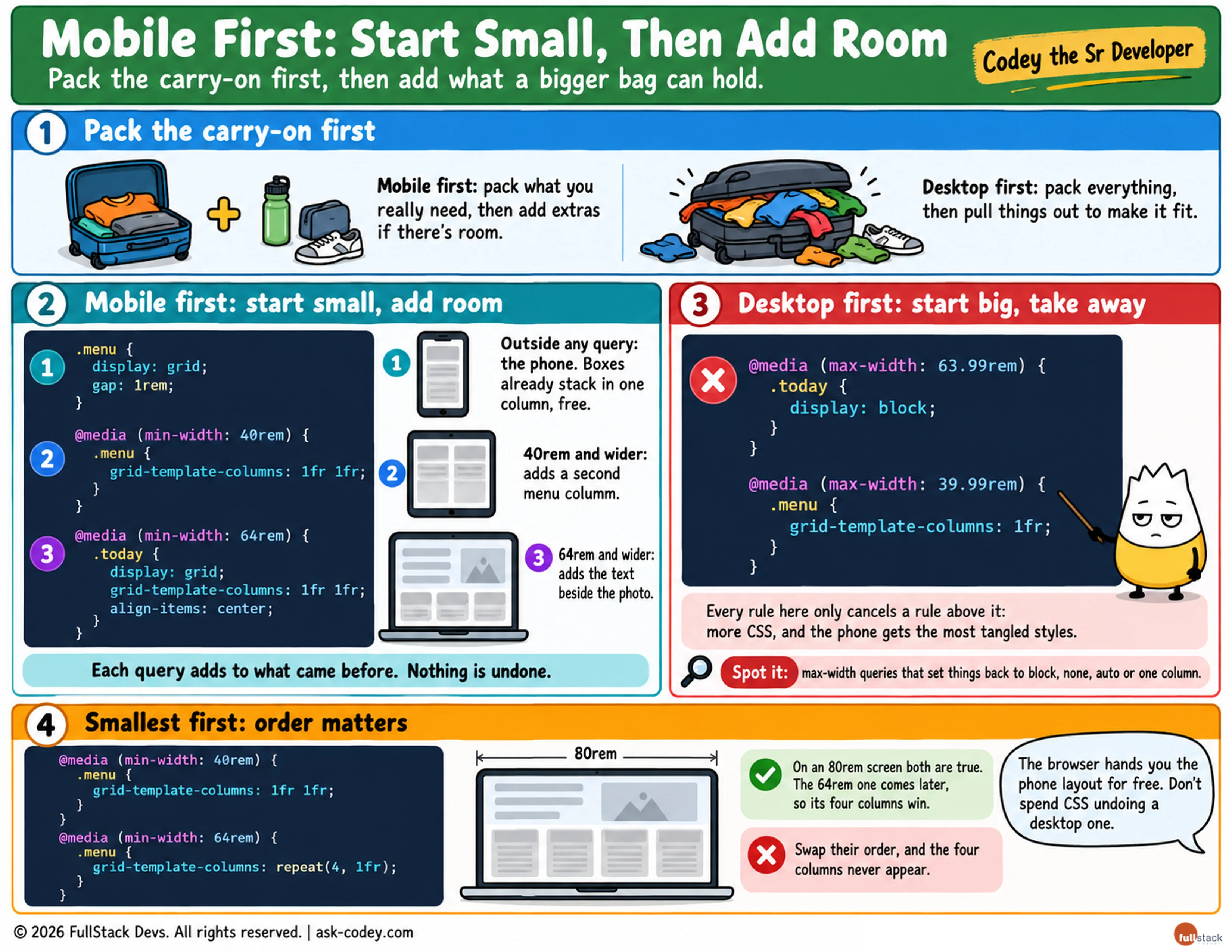
Mobile-first CSS writes the phone layout as the base styles and uses min-width media queries to add columns as the screen grows, which takes less CSS than shrinking a desktop layout down.
Updated
- Category
- CSS
- Level
- Journeyman
- Tags
- Breakpoint (css), CSS, Media query, Mobile-first design, web-development