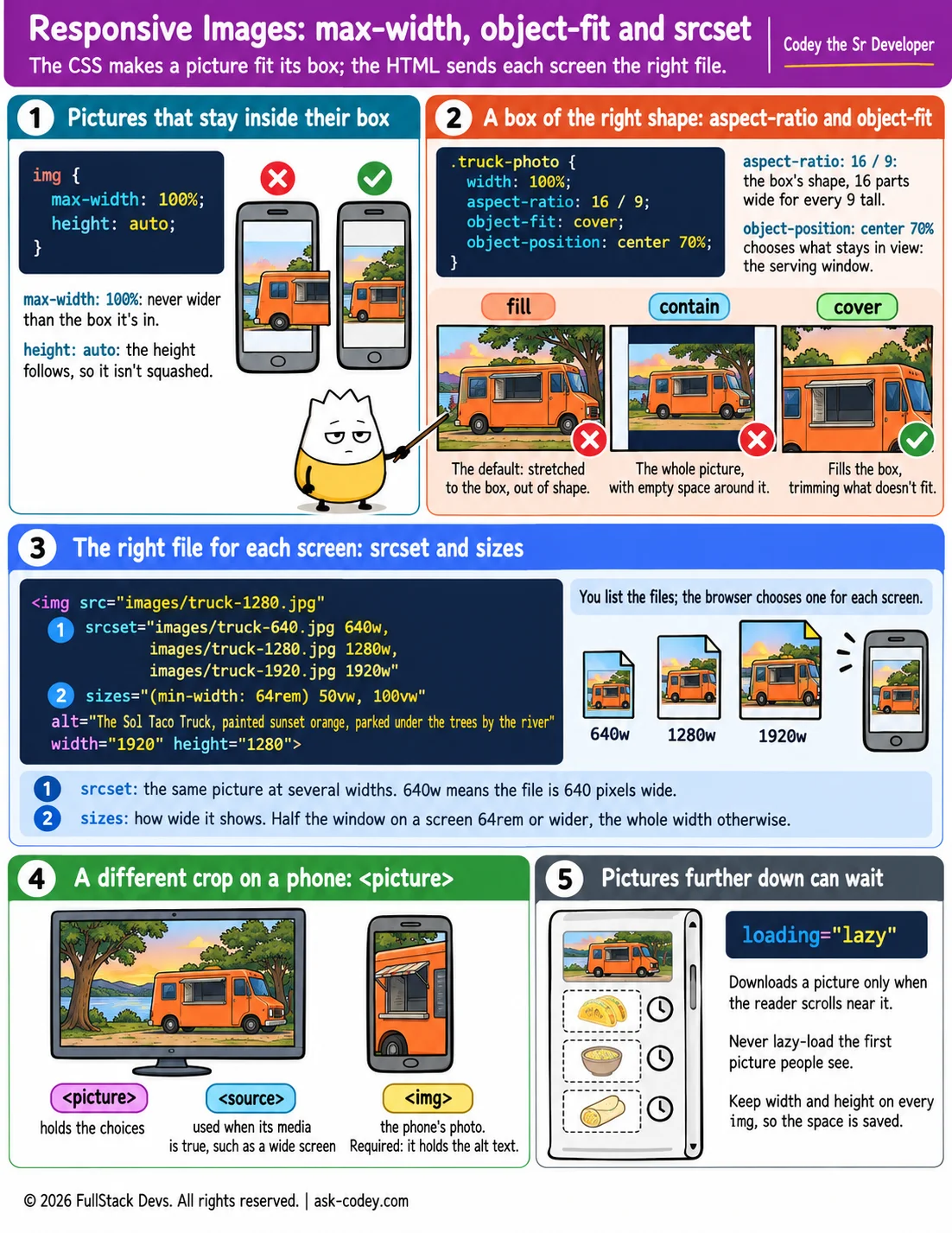
Responsive Images: max-width, object-fit and srcset
Make pictures fit any screen with max-width, aspect-ratio and object-fit in CSS, and send each screen a picture of the right size and crop with srcset, sizes, picture and lazy loading in the HTML.
Updated
- Category
- CSS
- Level
- Journeyman
- Tags
- <picture>, Aspect ratio, CSS, object-fit, Responsive image, sizes, srcset, web-development