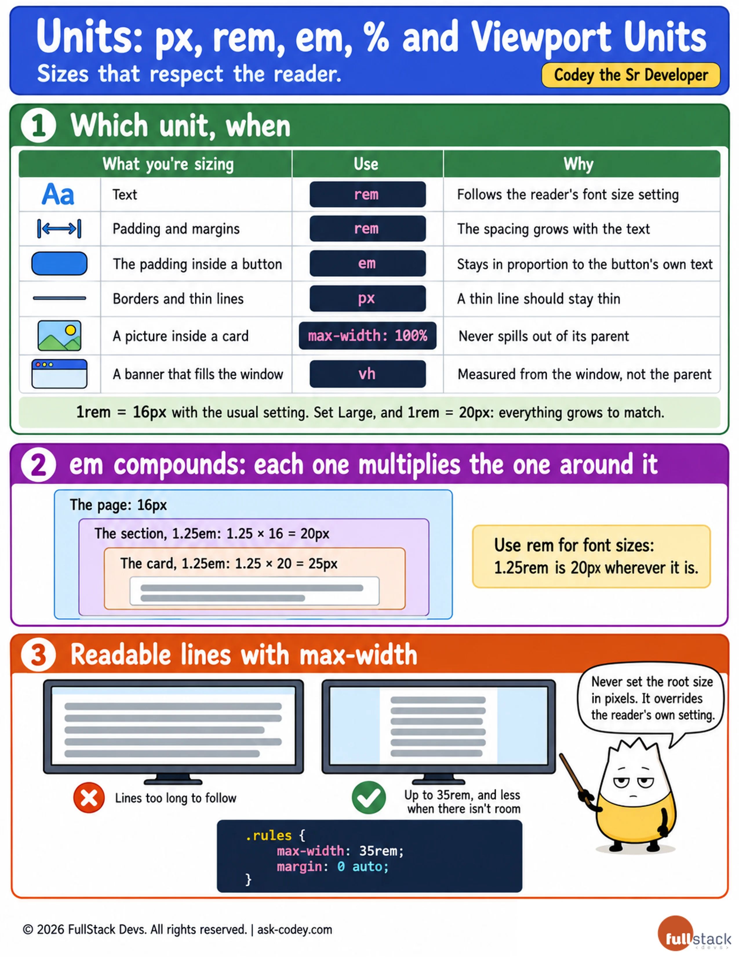
Units: px, rem, em, % and Viewport Units
Every size in CSS needs a unit, and choosing the right one, px, rem, em, %, vw or vh, decides whether your page grows with the reader's text, fits its space and stays readable.
Updated
- Category
- CSS
- Level
- Apprentice
- Tags
- CSS, em unit, Maximum size, Percentage, Pixel, rem unit, Viewport, web-development