Wrapping Text Around a Picture: float and clear
Wrap a story's words around a photo with float, keep a float from hanging out of its card with clear and display flow-root, and tell a float apart from an absolutely positioned box.
Apprentice · CSS · Updated
After this lesson you can
- Wrap text around a picture with float: left or float: right, with a width and a margin on the floated picture
- Keep a float inside its parent with display: flow-root, and start a later element below a float with clear
- Explain how a float leaves normal flow, and choose between a float and position: absolute
Key takeaways
- float: left or float: right moves a box to that side of its container, and the lines of text after it run down beside it, then go full width again below it.
- Give a floated picture a width and put the margin on the picture itself. The paragraph's own box runs underneath the float, so a margin on it doesn't push the words away.
- A float leaves normal flow, so its parent doesn't grow to hold it. display flow-root on the parent makes the parent wrap around its floats.
- clear: left, right or both on a later element starts it below the floats on that side, instead of beside them.
- A float pushes text aside; an absolutely positioned box sits on top of the text, which doesn't move out of its way.
Open a news story or a recipe blog on a computer: a photo sits at one side of the article, and the words run down beside it, then carry on across the full width underneath. Magazines have laid out pages that way for a hundred years. On the web it takes one property, float. You'll use it whenever a picture belongs beside its words, you'll meet it in older stylesheets that used it for whole page layouts before flexbox and grid existed, and web certification exams ask about it.
Paws & Whiskers picks one pet each week for a story card on the adoption list: Pet of the week. This week it's Clover, and the volunteers want her photo at the left of her story, with the words running down beside it.
The photo takes a line of its own
Here is the card. The photo comes between the heading and the story:
<article class="pet-of-the-week">
  <h2>Pet of the week: Clover</h2>
  <img class="pet-photo" src="images/clover.jpg"
       alt="Clover, a small gray rabbit with floppy ears, holding a sprig of parsley">
  <p>Clover is a calm 2-year-old rabbit who likes a quiet room and a fresh carrot. She has already learned her name.</p>
  <p class="visit-note">Come and meet her any day we're open.</p>
</article>
Normal Flow and the display Property showed that an <img> is inline: it sits in a line like a word. Here it has no words around it, so it gets a line of its own. The story starts under the photo, and on a wide screen there's a tall, empty space beside the photo where the words could be.
The plain tries don't help. display: block on the photo gives it a full line on purpose, which is the same picture. Moving the <img> inside the paragraph makes it one very tall word: a single line of the story sits beside the photo's bottom edge, and the rest starts below it.
float: the words flow around it
Think of a big rock in a stream. The rock stays at the edge, and the water runs around it and closes up again below it. A float is that rock: a box pushed to the left or right edge of its container, with the lines of text after it running around it.
.pet-photo {
  float: left;
  width: 200px;
  margin: 0 16px 8px 0;
}
float: left;moves the photo to the left edge of the card, as high up as it can go. Each line of the story that follows gets shorter, to fit beside the photo, and once the words are past the photo's bottom edge, the lines go full width again.float: right;is the mirror image: the photo at the right, the words down its left side. The starting value isfloat: none;.width: 200px;keeps the photo from floating at its full size. A float with no width is as wide as its content, and a photo wider than the card leaves no room for words beside it. The browser works out the height from the width, so the photo keeps its shape.- The margin goes on the float.
margin: 0 16px 8px 0;gives 16 pixels of room on the photo's right side, between it and the words, and 8 pixels below it. The next section shows why a margin on the paragraph wouldn't do it.
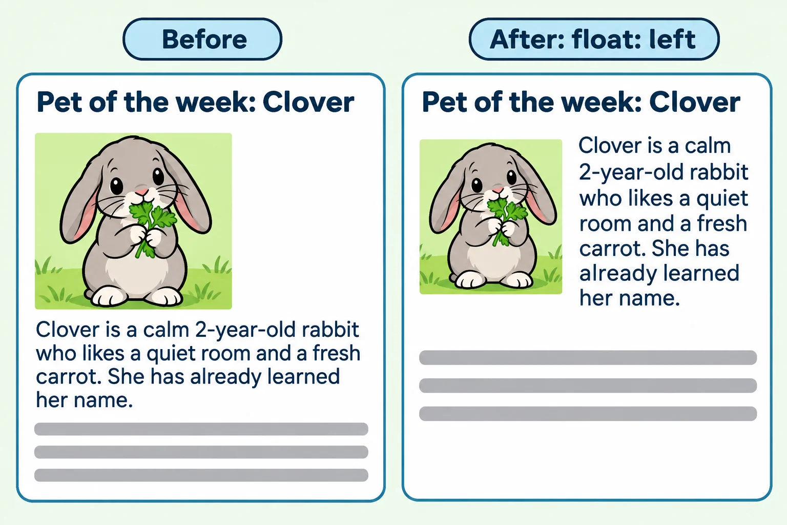
Try it. In your adoption-list folder, make float.html with a page skeleton and the card above, using any photo you have as images/clover.jpg. Add the .pet-photo rule in a <style> element, and make the story longer, about six sentences, so you can watch the lines go full width again under the photo. Then change left to right.
How a float leaves the flow
A float leaves normal flow, but only partly, and that explains the surprises:
- Block boxes act as if the float weren't there. The paragraph's box still starts at the card's left edge, behind the photo, and its background and border run underneath it.
- The lines of text inside them do see it. Each line shortens to fit beside the float.
So a margin on the paragraph, such as margin-left: 16px;, moves the paragraph's box, which is already behind the photo, and the words stay right up against the photo's edge. Room around a float goes on the float.
One more thing that changes: a float is laid out as a block, whatever it was before, so a floated link or span takes a width and padding the way an <img> does. And inside a flexbox or grid container, which this module teaches later, float does nothing at all: those containers place their items themselves.
Try it. In float.html, give the paragraph background-color: #f1faee;. The color runs under the photo too, from the card's left edge, because the paragraph's box is behind the float.
When the photo hangs out of its card
Clover's story is short. The heading and the two paragraphs are less tall than the photo, so the photo pokes out the bottom of the card and over whatever comes next on the page.
Here's why: a box grows to hold what's in normal flow, and the float has left it. The card's border wraps the heading and the paragraphs and stops there. A box holding nothing but a float would be zero pixels tall, which is called a collapsed parent.
The fix goes on the card:
.pet-of-the-week {
  display: flow-root;
}
display: flow-root; keeps the card a block, as before, and makes it a fresh layout area of its own, called a block formatting context. A box like that always grows to hold its floats, so the card's border goes all the way around the photo.
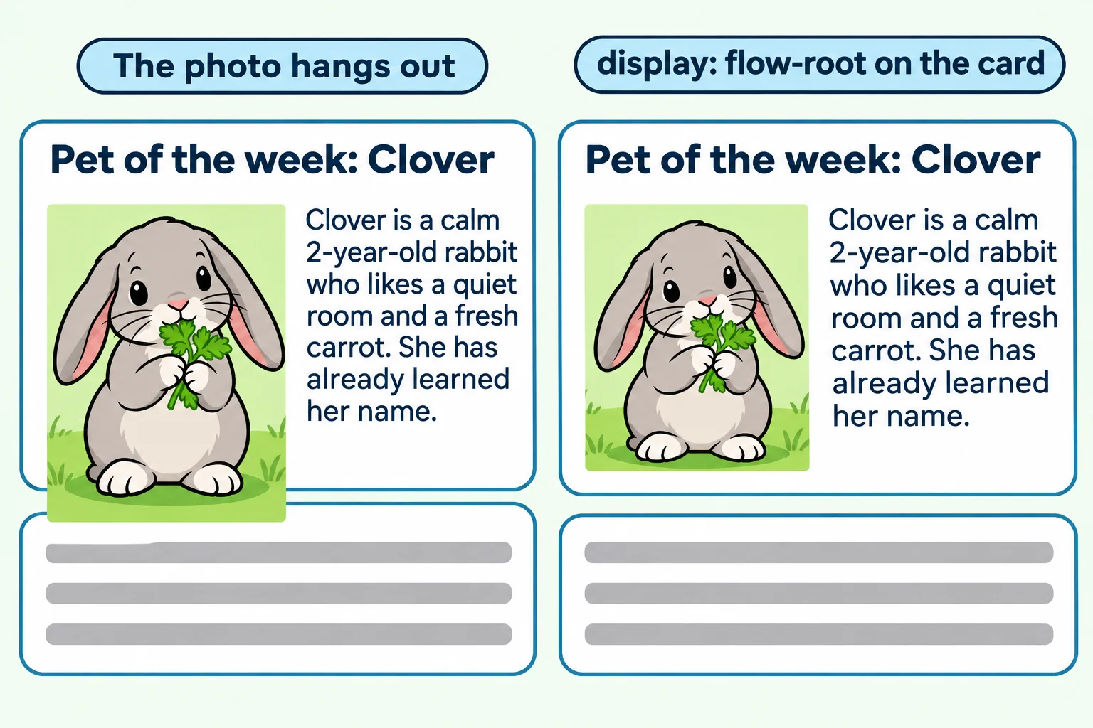
In older stylesheets you'll see two other fixes for the same problem: overflow: auto; on the card, which also makes a block formatting context (and can add scroll bars if anything is too wide), and a "clearfix", a few lines of CSS that add an empty piece to the end of the card with clear: both. Both still work. display: flow-root; says what you mean and does nothing else.
clear: start below the float
Sometimes the problem isn't the card but the next thing in it. Clover's visit note is meant to start on a fresh line under the photo, across the full width of the card, not squeezed in beside the photo:
.visit-note {
  clear: left;
}
clear goes on the element that should come after the float, and moves it down until it's below every float on that side:
| Value | The element starts below |
|---|---|
clear: left; |
every float on the left |
clear: right; |
every float on the right |
clear: both; |
every float on either side: the safe choice when you're not sure which side the float is on |
clear: none; |
nothing: the starting value |
clear and display: flow-root solve two different problems: clear moves a later element down below a float, and flow-root makes a parent grow around its floats.
float or position: absolute?
Later in this chapter, Positioning: relative and absolute pins a "New!" badge to the corner of a card with position: absolute. That also takes a box out of normal flow, but it treats the words around it very differently:
float: left or right |
position: absolute |
|
|---|---|---|
| Where it goes | The left or right edge of its container, as high as it can go | Exactly where its offsets put it, such as 8 pixels from the top right corner |
| The words around it | Move aside and run down beside it | Don't move: the box sits on top of them |
| Use it for | A photo or a quote that the text wraps around | A badge, a close button or a caption on top of a picture |
And for a row of cards or a page in columns, use neither: flexbox and grid, later in this module, are made for that job.
Do it: put Biscuit's photo beside his story
Biscuit went home last week, and the shelter's Happy endings card tells his story. The volunteers want his photo at the right of the story, with the words running down its left side. Right now the photo takes a line of its own and is far too big.
Your job: write two rules, one for .story-photo and one for .happy-ending.
- The photo (
.story-photo) sits at the right side of the card,200pxwide, with the story's lines running down its left side. - Room around the photo:
16pxbetween the photo and the words beside it, and8pxbelow the photo. - The card (
.happy-ending) grows to wrap its border around the whole photo, so the photo doesn't hang out of its bottom.
The checks tick as each part is in place.
Practiced live on the lesson page: write the CSS right there and check it.
Check yourself
2 questions to try on the lesson page.
So what
A float is the rock in the stream: the words flow around it. Give it a width and its own margin, let its parent hold it with display: flow-root, and start the next thing below it with clear, and a photo sits beside its story the way it does in a magazine.