Bootstrap and Tailwind: What a Framework Gives You and What It Costs
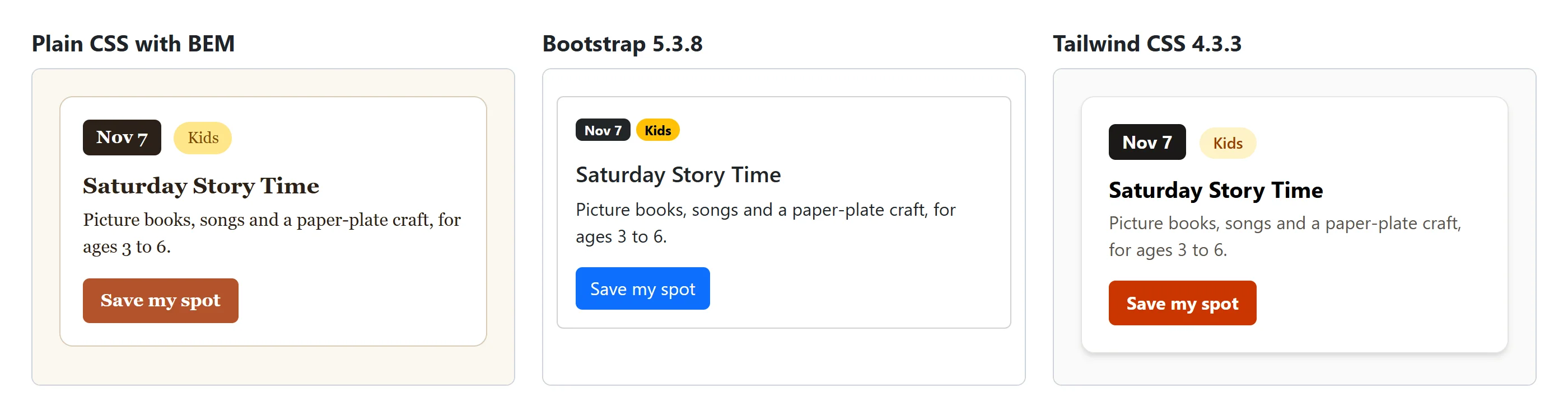
The same library event card built in plain CSS, in Bootstrap 5.3.8 and in Tailwind CSS 4.3.3 shows what a CSS framework gives you (speed, consistency, ready-made parts and a responsive grid), what it costs (download size, look-alike sites, new names), how your own CSS makes it yours, and what to check before starting from a template.
Journeyman · CSS · Web Development · Updated
After this lesson you can
- Build a component with Bootstrap or Tailwind classes loaded from a CDN, read what each class does, and restyle it with your own CSS
- Weigh what a CSS framework gives and costs, and choose plain CSS with BEM, utility classes, Bootstrap or Tailwind for a project
- Lay out a responsive page with a framework's grid: Bootstrap's container, row and col-md-* classes, or Tailwind's md: prefix
- Start a page from a ready-made template: check its license and accessibility, and remove what you don't use
Key takeaways
- A CSS framework is a stylesheet of ready-made classes, loaded from a CDN: Bootstrap gives whole components such as card and btn, and Tailwind CSS utilities such as px-3 that you combine.
- Both lay out a page mobile first. Bootstrap's container, row and col-md-8 classes, and Tailwind's md: prefix, apply from the md breakpoint (768px) up; below it, things stack.
- A template is a whole ready-made page. Check its license and its accessibility, and remove what you don't use, before you make it yours.
- You gain speed and a consistent look, and pay with download size, look-alike sites and new names. Bootstrap suits a quick, standard site; Tailwind a team with a build step.
- Your own CSS is what makes a framework yours. In Bootstrap, set its --bs- variables in your own class; in Tailwind, add your colors in @theme.
You're in a group project with a deadline on Friday. One teammate says "let's use Bootstrap", another says "Tailwind is better", and a third has already written half the CSS by hand. Job listings ask for these names too, and you'll inherit sites built on both. To choose, and to argue for your choice, you need to know what a CSS framework actually does for you and what it takes in return. The fastest way to find out is to build the same thing three times: one event card from the Maple Street Library's events page, in plain CSS, in Bootstrap and in Tailwind CSS.
What a framework is
Moving into a furnished apartment is fast: the couch, the table and the lamps are already there. You can live in it on day one. But the couch is the same one the neighbors have, and if you want a different one, you have to move theirs out first.
A CSS framework is the furnished apartment: a big stylesheet someone else wrote, full of ready-made classes for buttons, cards, forms and spacing. You add it to a page and put its class names on your elements. Most people load it from a content delivery network (CDN): servers around the world that host popular files, so your page links to a copy instead of you hosting it. The version goes in the address, such as bootstrap@5.3.8, so the file never changes under you.
The card in plain CSS
You've already seen this card in BEM. The HTML has one class per part:
<article class="event-card">
  <p class="event-card__date">Nov 7</p>
  <p class="event-card__tag event-card__tag--kids">Kids</p>
  <h2 class="event-card__title">Saturday Story Time</h2>
  <p class="event-card__text">Picture books, songs and a paper-plate craft, for ages 3 to 6.</p>
  <a class="event-card__button" href="#save">Save my spot</a>
</article>
Behind it are about 60 lines of CSS that you wrote and own: the white box, the brown date badge, the yellow tag, the orange button. Nothing to download but your own file, and the page looks like no one else's. The cost is time: every one of those lines was a decision.
The card in Bootstrap
Bootstrap is a free framework of ready-made styles and components. A Bootstrap component is a ready-made piece of a page, such as a navbar, an alert or a card: a box for one item, with a title, text and buttons. You write plain HTML and give it Bootstrap's class names:
<!DOCTYPE html>
<html lang="en">
<head>
  <meta charset="utf-8">
  <meta name="viewport" content="width=device-width, initial-scale=1">
  <title>Events at Maple Street Library</title>
  <link rel="stylesheet" href="https://cdn.jsdelivr.net/npm/bootstrap@5.3.8/dist/css/bootstrap.min.css" integrity="sha384-sRIl4kxILFvY47J16cr9ZwB07vP4J8+LH7qKQnuqkuIAvNWLzeN8tE5YBujZqJLB" crossorigin="anonymous">
</head>
<body class="container py-4">
  <article class="card">
    <div class="card-body">
      <p><span class="badge text-bg-dark">Nov 7</span> <span class="badge rounded-pill text-bg-warning">Kids</span></p>
      <h2 class="card-title h5">Saturday Story Time</h2>
      <p class="card-text">Picture books, songs and a paper-plate craft, for ages 3 to 6.</p>
      <a class="btn btn-primary" href="#save">Save my spot</a>
    </div>
  </article>
</body>
</html>
card and card-body make the bordered box and its padding, badge makes a small label, text-bg-warning colors it yellow with dark text, btn btn-primary makes Bootstrap's blue button, and h5 makes the <h2> the size of a smaller heading without changing what it means. container gives the page a centered width, and py-4 is one of Bootstrap's utilities: padding on the top and bottom. The integrity attribute is a fingerprint of the file, so the browser refuses a copy that has been changed.
Try it. Save the page as bootstrap-card.html and open it. Then change text-bg-warning to text-bg-success, and btn-primary to btn-outline-dark. You restyled the card without writing any CSS.
The card in Tailwind
Tailwind CSS is a utility-first framework: no card class, only utilities that you combine on every element. Tailwind's browser build, one <script> line, is the quickest way to try it:
<!DOCTYPE html>
<html lang="en">
<head>
  <meta charset="utf-8">
  <meta name="viewport" content="width=device-width, initial-scale=1">
  <title>Events at Maple Street Library</title>
  <script src="https://cdn.jsdelivr.net/npm/@tailwindcss/browser@4.3.3"></script>
</head>
<body class="bg-stone-50 p-6">
  <article class="max-w-sm rounded-xl border border-stone-200 bg-white p-6 shadow-md">
    <p class="inline-block rounded-md bg-stone-900 px-3 py-1 font-bold text-white">Nov 7</p>
    <p class="ml-2 inline-block rounded-full bg-amber-100 px-3 py-1 text-sm font-semibold text-amber-800">Kids</p>
    <h2 class="mt-3 text-xl font-bold">Saturday Story Time</h2>
    <p class="mt-1 text-stone-600">Picture books, songs and a paper-plate craft, for ages 3 to 6.</p>
    <a class="mt-4 inline-block rounded-md bg-orange-700 px-4 py-2 font-bold text-white hover:bg-orange-800" href="#save">Save my spot</a>
  </article>
</body>
</html>
Each class is one declaration with a short name: rounded-full is fully rounded corners, bg-amber-100 a light amber background (100 is light, 900 is dark), px-3 padding left and right of 0.75rem, text-sm small text. hover:bg-orange-800 (read "hover, bg orange 800") applies a darker background only while the mouse is over the link.
The browser build is for trying Tailwind out only. It's a JavaScript file that reads your page and writes the CSS in the visitor's browser on every visit. A real Tailwind site runs Tailwind's build tool on your own computer, which finds the classes your HTML uses and writes a small CSS file with only those.
Laying out a whole page: a framework's responsive grid
One card is done, but the events page is more than a card: a column of upcoming events, and beside it a box with the library's opening hours. On a laptop the two should sit side by side, the events taking about two-thirds of the width. On a phone there's no room for that, so the hours should drop below the events. You know how to do this by hand, with a media query and a breakpoint (Media Queries and Breakpoints, in Module 4). Both frameworks have the same idea built in, as class names.
Bootstrap's grid is three kinds of box, always nested in this order: a container, the outer box, centered, with a maximum width that suits the screen; a row, one band across it; and the columns inside the row. Every row is split into 12 equal columns, and a column's class says how many of the 12 it spans. Twelve divides into halves, thirds, quarters and sixths, so most layouts fit.
A breakpoint goes in the middle of the class name. col-md-8 is read "column, medium, 8": 8 of the 12 columns, from the md breakpoint up. Below that width, a column takes the full width, so the columns stack:
<div class="container">
    <div class="row">
        <div class="col-12 col-md-8">Main content</div>
        <div class="col-12 col-md-4">Sidebar</div>
    </div>
</div>
On the events page, the main content is the list of events and the sidebar is the opening hours. On a phone, col-12 gives each one all 12 columns, so the hours sit under the events. From a tablet up, 8 + 4 = 12 puts them side by side. That's mobile first, the way you write your own media queries: the phone layout first, then what changes as the screen grows. Bootstrap's breakpoints:
| Infix | Screen width | Typical device |
|---|---|---|
| (none) | any | phones and up |
sm |
576px and wider | large phones |
md |
768px and wider | tablets |
lg |
992px and wider | laptops |
xl |
1200px and wider | desktops |
xxl |
1400px and wider | large desktops |
A column can use several at once. col-12 col-sm-6 col-lg-3 on four event cards gives one card per row on a phone, two on a large phone or tablet, and four on a laptop. Underneath, a row is a flexbox container and each col-md-8 is a media query that sets a width, the same CSS you've written yourself.
Tailwind has no grid of its own classes. It puts a breakpoint in front of any utility instead, as a prefix with a colon: md:grid-cols-3 (read "md, grid cols 3") means "from the md breakpoint up, three columns". A utility with no prefix applies at every size, so this is mobile first too:
<div class="grid grid-cols-1 gap-6 md:grid-cols-3">
  <article>Saturday Story Time</article>
  <article>Coding Club</article>
  <article>Film Night</article>
</div>
One column of event cards on a phone, three side by side from 768 pixels up. Tailwind's md starts at the same 768 pixels as Bootstrap's, but its other breakpoints differ: sm is 640px, lg 1024px, xl 1280px and 2xl 1536px. Any utility takes a prefix: md:p-8, lg:text-xl, hover: too, the same way.
Try it. In bootstrap-card.html, put the card inside <div class="row"> and <div class="col-12 col-md-8">, and add a second <div class="col-12 col-md-4"> after it holding the line Open 9 a.m. to 8 p.m. Make the window narrow, then wide, and watch the hours move.
Starting from a template
Sometimes even a grid and a few components is more work than the job needs. A template is a whole ready-made page, HTML and CSS (usually built on a framework), for a common job: a landing page, a portfolio, a sign-in page, a dashboard. You download it, put your own words and pictures in, and you have a finished-looking page in an hour. Bootstrap's own website has a set of example pages to start from, and many more templates are sold or given away elsewhere, each with its own license.
A template is someone else's whole house, not only their furniture, so look around before you move in:
- The license. Can you use it on your site, and on a client's or employer's? Do you have to credit its author? A free download isn't always free to use.
- Accessibility. Headings in order, alt text on every picture, readable contrast, and a page you can use with the Tab key alone. A pretty template can fail all four, and once it's your site, those failures are yours.
- What you don't use. Delete the sections, scripts and fonts your page doesn't need, so visitors don't download them, and replace every placeholder (the sample text, the stock photos, the fake contact details).
- Its age. A template built on an old framework version keeps that version's bugs. Check which version it loads.
Then make it yours, the same way as a framework: your colors and fonts in your own stylesheet, linked after the template's, so the site doesn't look like every other site that downloaded it.
What you gain, and what you pay
All three cards work. Here is what each one costs and gives, measured for this card:
| Plain CSS with BEM | Bootstrap 5.3.8 | Tailwind CSS 4.3.3 | |
|---|---|---|---|
| You write | every rule, about 60 lines | HTML with its classes | HTML with its classes |
| The visitor downloads | your file, a few KB | 232 KB of CSS (31 KB compressed), for every page, most of it unused | with the build tool, only what you used: 8 KB for this card (2.4 KB compressed). The browser build: a 282 KB script (71 KB compressed) |
| Ready-made parts | none | cards, navbars, forms, modals; menus that open need its JavaScript file too | none: you build each part from utilities |
| It looks like | yours | Bootstrap, until you change it | your choices on Tailwind's scale |
| New names to learn | only yours | card-body, text-bg-warning, mb-2 |
px-3, bg-amber-100, rounded-full |
| A build step | no | no | yes, for a real site |
What you gain is speed and consistency. A team can put together a working, decent-looking page in an afternoon, and every button and gap matches, because everyone uses the same classes on the same scale.
What you pay:
- Download size. Bootstrap sends the whole framework to every visitor. Tailwind's build tool solves that, at the price of a build step.
- Look-alike sites. A site with Bootstrap's blue buttons and default cards looks like thousands of others, and visitors notice.
- A new set of names.
mt-4is 1.5rem in Bootstrap and 1rem in Tailwind. And Tailwind's reset takes the browser's heading sizes away: an<h2>with no classes looks like plain text.
You still need CSS to make it yours
A framework gives you a starting point, not your library's look. Both let your own CSS take over. In Bootstrap, a button reads its colors from variables that start with --bs-, so a class of your own can set them, in a stylesheet linked after Bootstrap's:
.btn-maple {
  --bs-btn-color: #ffffff;
  --bs-btn-bg: #b4532a;
  --bs-btn-border-color: #b4532a;
  --bs-btn-hover-color: #ffffff;
  --bs-btn-hover-bg: #8a3c1c;
  --bs-btn-hover-border-color: #8a3c1c;
}
class="btn btn-maple" is now a maple-orange button with all of Bootstrap's button behavior. In Tailwind, you add your own colors to its scale in @theme (read "at theme"), inside a <style type="text/tailwindcss"> block with the browser build, or in your CSS file with the build tool:
@theme {
  --color-maple: #b4532a;
  --color-maple-dark: #8a3c1c;
}
--color-maple creates the utilities bg-maple, text-maple and border-maple, so the button becomes bg-maple hover:bg-maple-dark. Either way, the cascade, specificity and custom properties you learned in this course are what make it work. A framework doesn't replace CSS; it's written in it.
Which one fits?
There's no winner, only a fit:
- Plain CSS with BEM for a small site, a one-of-a-kind look, or when you're learning: everything on the page is something you understand.
- Bootstrap for a site that has to work this week and looks fine with standard parts: an internal tool, an admin dashboard, a prototype. Its ready-made menus and forms save the most time.
- Tailwind for a team that wants its own look, is happy to run a build step, and builds pages from reusable templates or JavaScript components, so each long list of classes is written once.
- Utility classes of your own fit inside any of these, for the small jobs.
Try it. For the library's events page, which would you choose, and why? Write two sentences: one on what you'd gain, one on what you'd pay.
Do it: make the Coding Club's button the club's green
Maple Street Library's events page is built with Bootstrap, and every Save my spot button is Bootstrap's blue. The Coding Club wants its own button in the club's green, #2f6b3a, with a white label, turning a darker green, #1f4a27, when someone points at it. The HTML already says class="btn btn-club".
The box loads a cut-down copy of Bootstrap 5.3.8's button rules first, as if your stylesheet were linked after Bootstrap's. Like the real ones, they read their colors from --bs-btn- variables.
- The Coding Club's button is the club green with a white label.
- Pointing at it turns it the darker green.
- It keeps all of Bootstrap's button behavior: set Bootstrap's own button variables, and leave Bootstrap's
.btnrule as it is. - The other events' buttons stay Bootstrap blue.
Practiced live on the lesson page: write the CSS right there and check it.
Do it: put the opening hours beside the events on a tablet
The library's events page shows its upcoming events and its opening hours one under the other on every screen. On a phone that's right. On a tablet or a laptop, the librarians want them side by side, with the events taking two-thirds of the width.
| Screen | Events | Opening hours | How they sit |
|---|---|---|---|
| A phone, narrower than 768px | 12 of 12 columns | 12 of 12 columns | the hours under the events |
A tablet or wider, 768px and up (md) |
8 of 12 columns | 4 of 12 columns | side by side: 8 + 4 = 12 |
Your job: add Bootstrap's grid to the page in the box.
- Put the events section and the hours box inside a Bootstrap container that holds one row.
- Make the events section a column of that row: 12 of 12 on a phone, and 8 of 12 from the
mdbreakpoint up. Write both sizes, phone first. - Make the hours box a column too: 12 of 12 on a phone, and 4 of 12 from
mdup. - Keep the events first and the hours second.
The box shows a cut-down copy of Bootstrap's grid rules. Make the preview wider and narrower to watch the hours move.
Practiced live on the lesson page: write the HTML right there and check it.
Check yourself
2 questions to try on the lesson page.
So what
Frameworks are furniture: they get you moved in fast, and you still decide what stays. Knowing what Bootstrap and Tailwind do with plain CSS underneath means you can pick one for a reason, read any codebase that uses one, and make it look like your project instead of everyone else's.